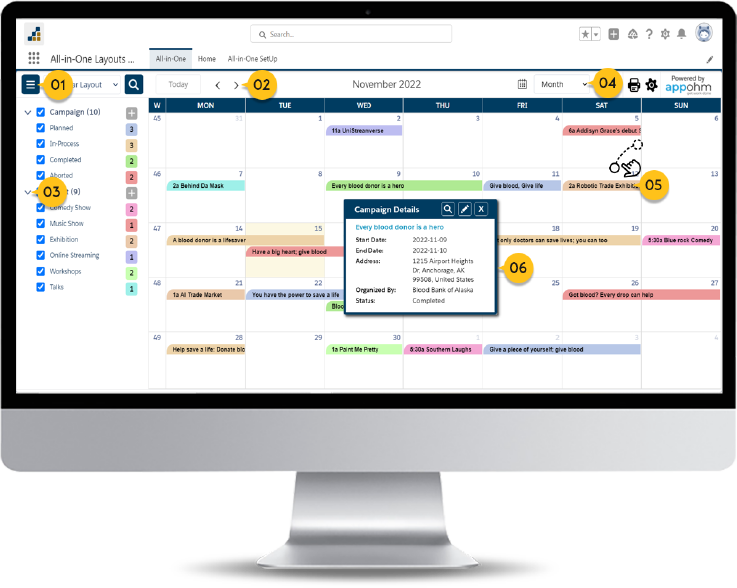


Varied data visualizations, multiple layouts
Unlock diverse data insights with adaptable visualizations and flexible layouts. With our comprehensive suite of tools, you can customize your data presentation to suit your specific needs.
Experience the power of tailored data visualization and layouts, designed to enhance your workflow and drive better decision-making.
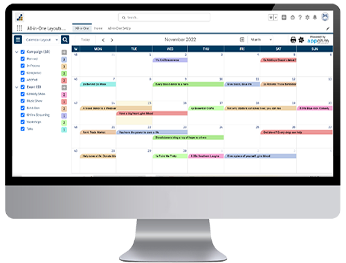
 Calendar
Layout
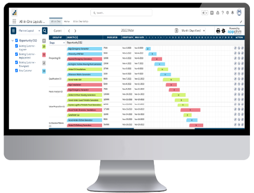
 Planner
Layout
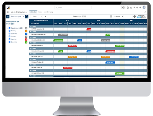
 Resource
Layout
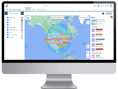
 GeoMap
Layout